
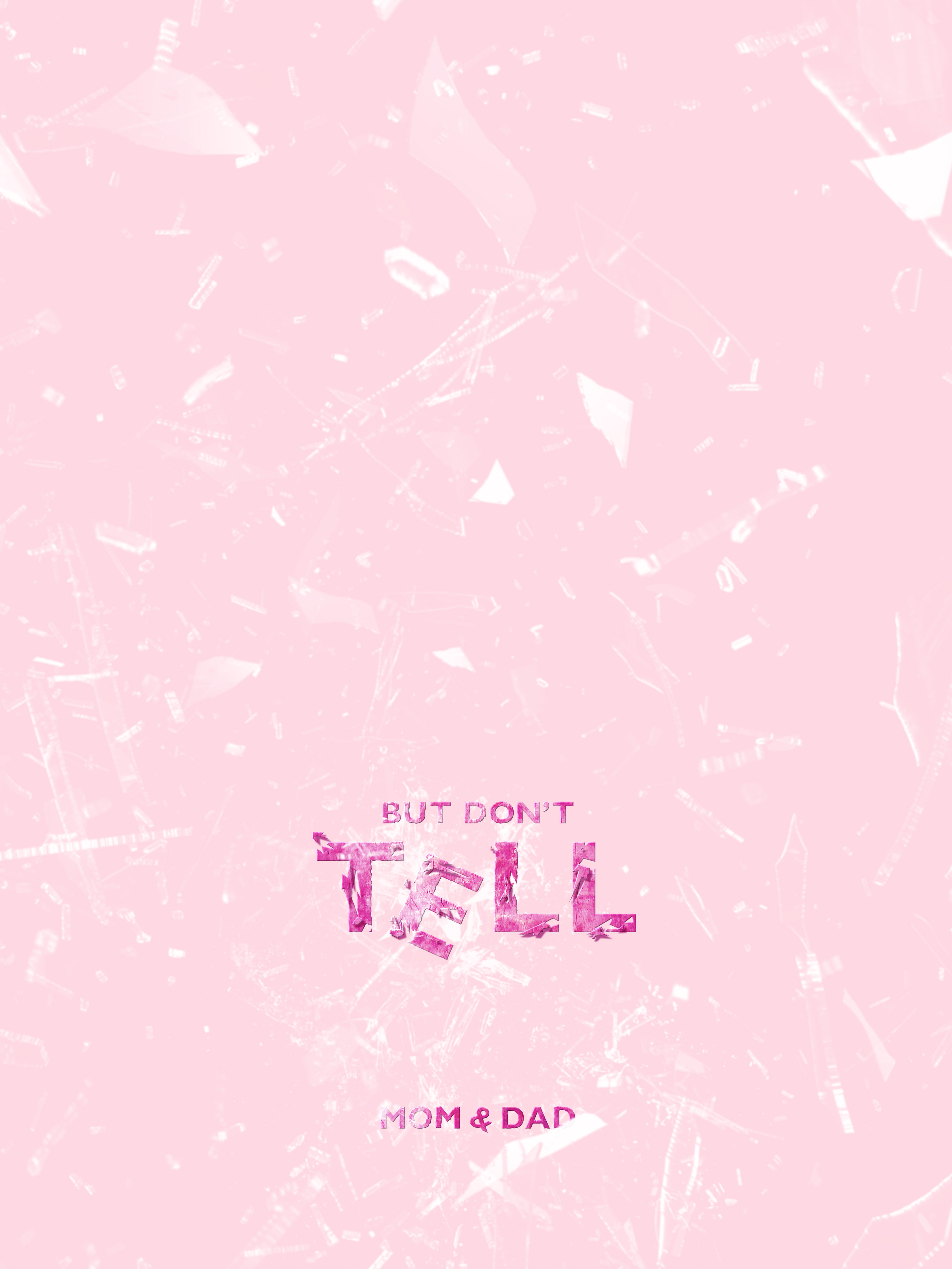
"But Don't Tell Mom & Dad"
"But Don’t Tell Mom & Dad," is my six-word memoir for this Typography assignment. This composition resembles the close relationship of the three sisters, specifically highlighting the chaos of when something goes wrong in the three sisters' time together. This poster represents the situation of the sisters breaking their mom’s beloved family vase. The vase falling off of the shelf is represented in the slight tilt and baseline difference of the “E”. In addition, the glass texture was created and applied in Photoshop. The type of “tell” was created using masking tools and displacement maps to develop a glass-shattering texture. Not only does the “tell” represent the shattering of the vase, but the breakage of trust between the sisters is in the fear that one of them will tell mom and dad. The space at the top of the composition represents the silent wait and processing of the situation before the parents find the vase and decide on the punishment. In cohesiveness with the “E”, the ampersand between mom and dad is tilted to represent the difference in parenting styles between the parents, as one is usually the good cop and the other is the bad cop. Gills San Nova type was chosen as the typeface due to its bold and playful manner. It is set to all caps to embody the chaos and shouting of when the vase broke and the aftermath within the household. Overall, this six-words memoir represents the valued relationship I have with my sisters and the bond we have with the trouble we get into.
"Fight, Lead, Join for you"
“Fight for things that you care about, but do it in a way that will lead others to join you.” – Ruth Bader Ginsburg
When assigned this project I was selected to create a visual representation of this quote. Ginsburg stated this quote when she was awarded the Radcliffe Medal for being an individual who has made a transformative impact on society. Ginsburg was an American lawyer who served on the Supreme Court; she made an incredible impact on women’s rights and their role in society. Ginsburg’s call to action to the women at the award ceremony was to not settle, but rather continue the movement for women’s rights. Proxima Nova all-caps represent the bold and confident aspects of going against social norms and petitioning for transformative action. The italic treatment of the terms “Fight,” “Lead,” and “Join” were used to emphasize the call-to-action Ginsburg is presenting and the physical movement activists participated in. The large and bold type treatment of the “You” emphasizes Ginsburg’s call to action for every woman in society. The right alignment represents the moment in our history when women no longer must fight for women’s rights but are aligned with men, after years of petitions, protests, and movements. Ruth Bader Ginsburg is in a thin typeface at the top of the composition to represent respect and a well-spoken attitude of Ginsburg. Overall, this quote represents the power and movements that Ginsburg called to action for women’s rights.

Words In Motion
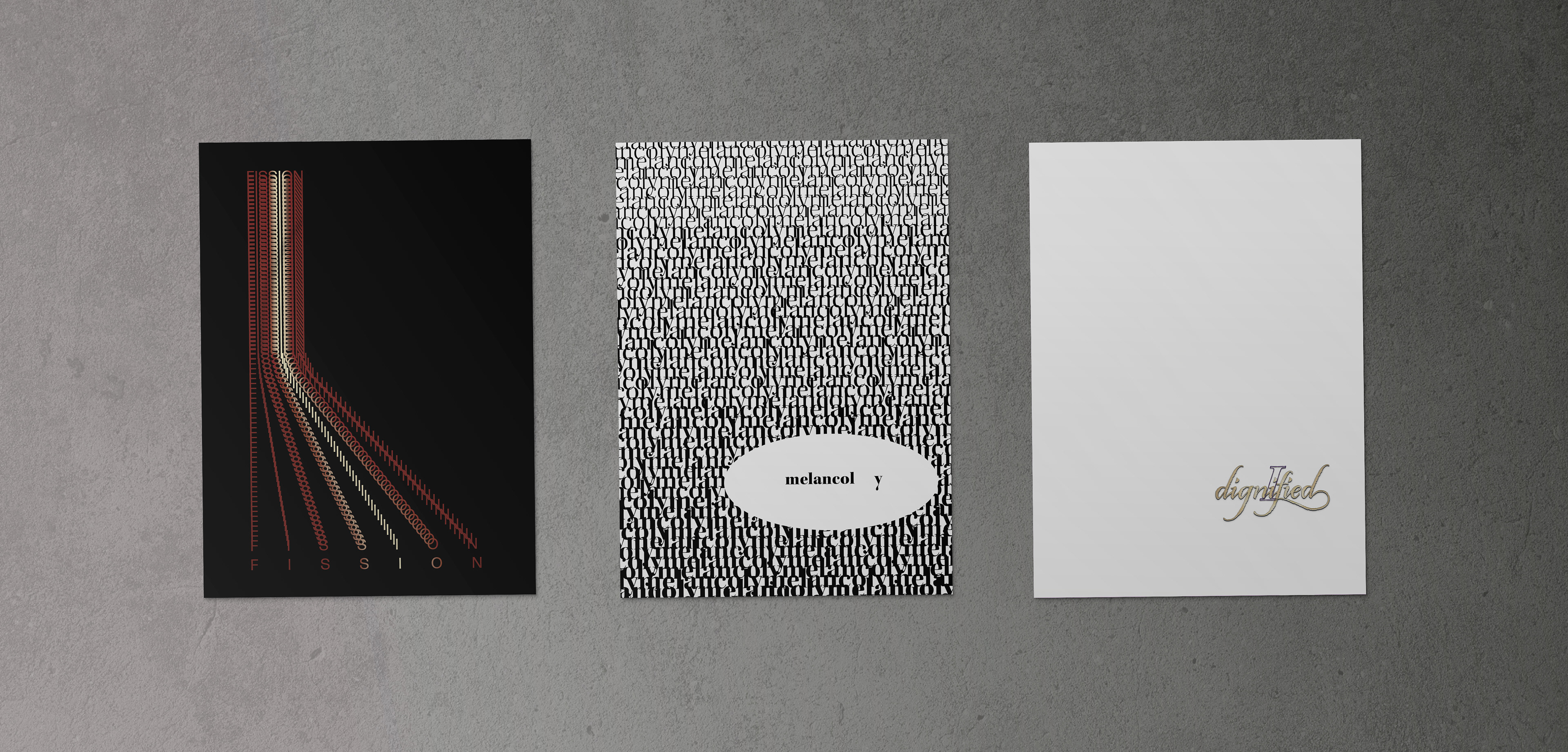
Fission: a splitting or breaking up into parts
This composition represents the definition of Fission. The general shape of the repetition of fission resembles a beaker glass to represent the scientific interpretation of breakage. The highlight on the “I”, was intentionally created to represent the flash that occurs when atoms spit concerning the definition of fission. Fission is closely overlayed at the top of the composition until further down the piece where the phrase splits vertically while the letterspacing increases. Forma DJR Micro was the type selected for this piece due to its mathematical characteristics and tall x-height that adds value to the splitting of the word itself. Overall, all aspects of this piece represent the splitting of the word fission to represent its definition.